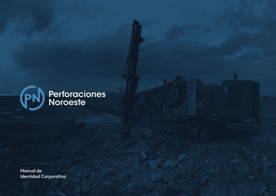
It was time to modernise the company's image, and we have succeeded!
After more than 40 years in the world, Perforaciones Noroeste takes another step forward in its journey and manages to modernise its entire corporate image, without losing the essence that saw its birth.
Without losing sight of our origins, we have managed to give a twist to what would become our logo, keeping the P for Perforaciones and the N for Noroeste, within a single circle, which brings the company together as a whole.
The colour blue, symbol of our northern land, our beloved Asturias, continues to be our flag, but it is a modern blue, creating a modern and dynamic colour palette that allows us to build well contrasted content, with enough contrast so that all eyes can appreciate even the smallest detail.
On a typographic level, we have chosen more rounded and stick fonts, always a symbol of modernity, but clearly legible on any device and in practically all sizes.
We hope you like it as much as we do :)
Latest News
-
07/05/2026
A tribute to our roots. The Asturias-León Mining Region -
23/03/2026
Concluding the Commuter Rail Network Expansion Project: Madrid – Soto del Real Joint Venture, commissioned by Adif. -
26/02/2026
Demolition of two chimneys at the Compostilla II Thermal Power Plant in El Bierzo -
21/01/2026
Ending the year by re-affirming who we are and where we are headed at Perforaciones Noroeste. -
01/12/2025
The Mazucu Rebulle Trail (3rd edition) took place in Llanes (Asturias) and was sponsored by Perforaciones Noroeste.


